
Visual identity | Brand application
Parnell & Co Catering: Branding a catering company that prides itself on classical cookery, elevated elegantly
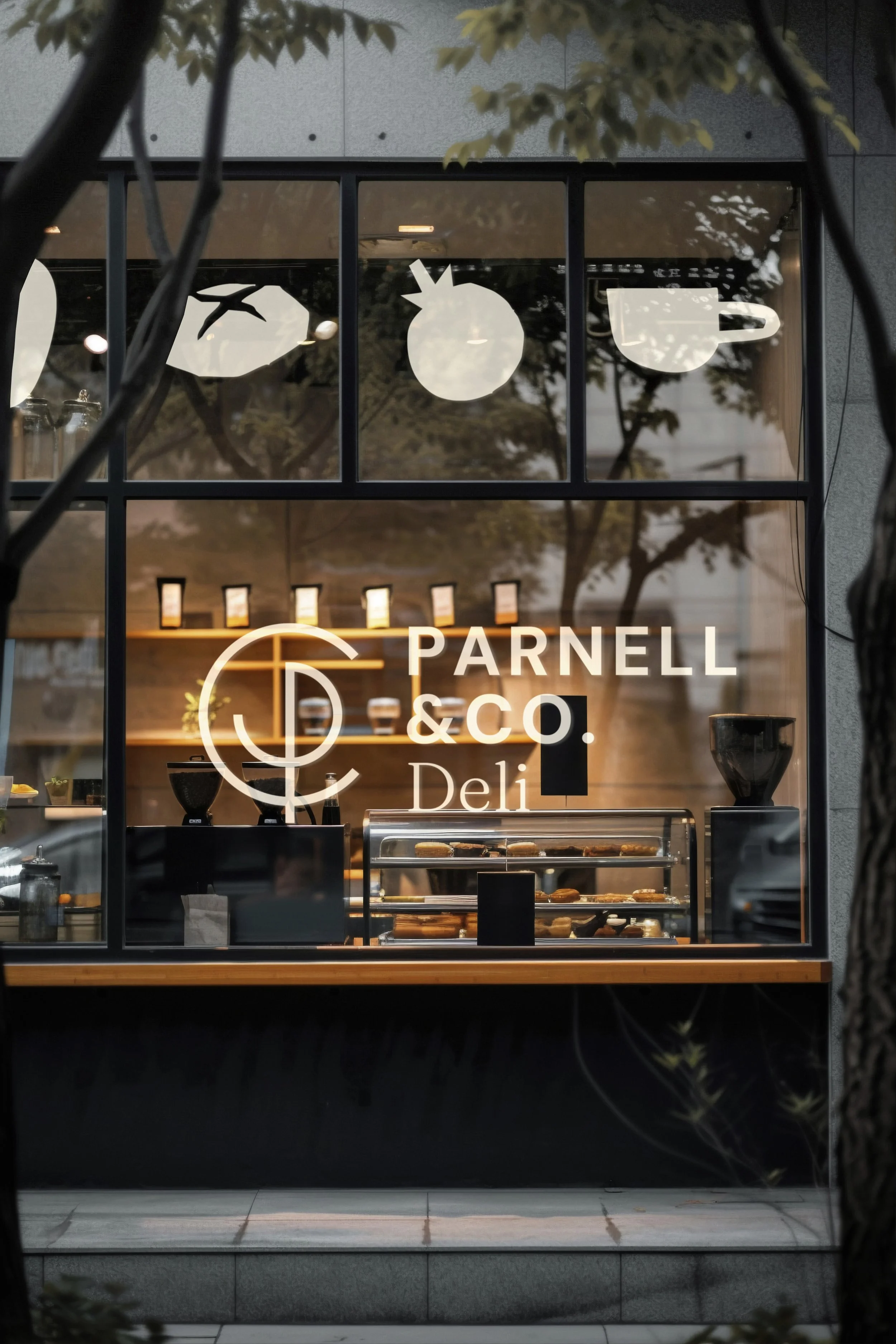
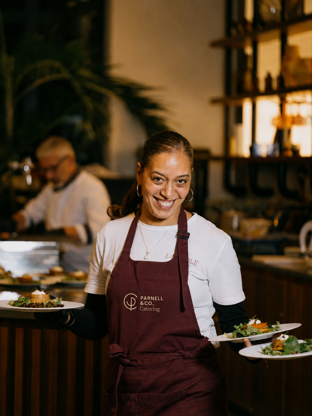
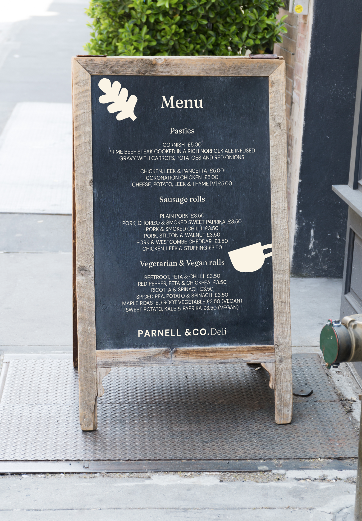
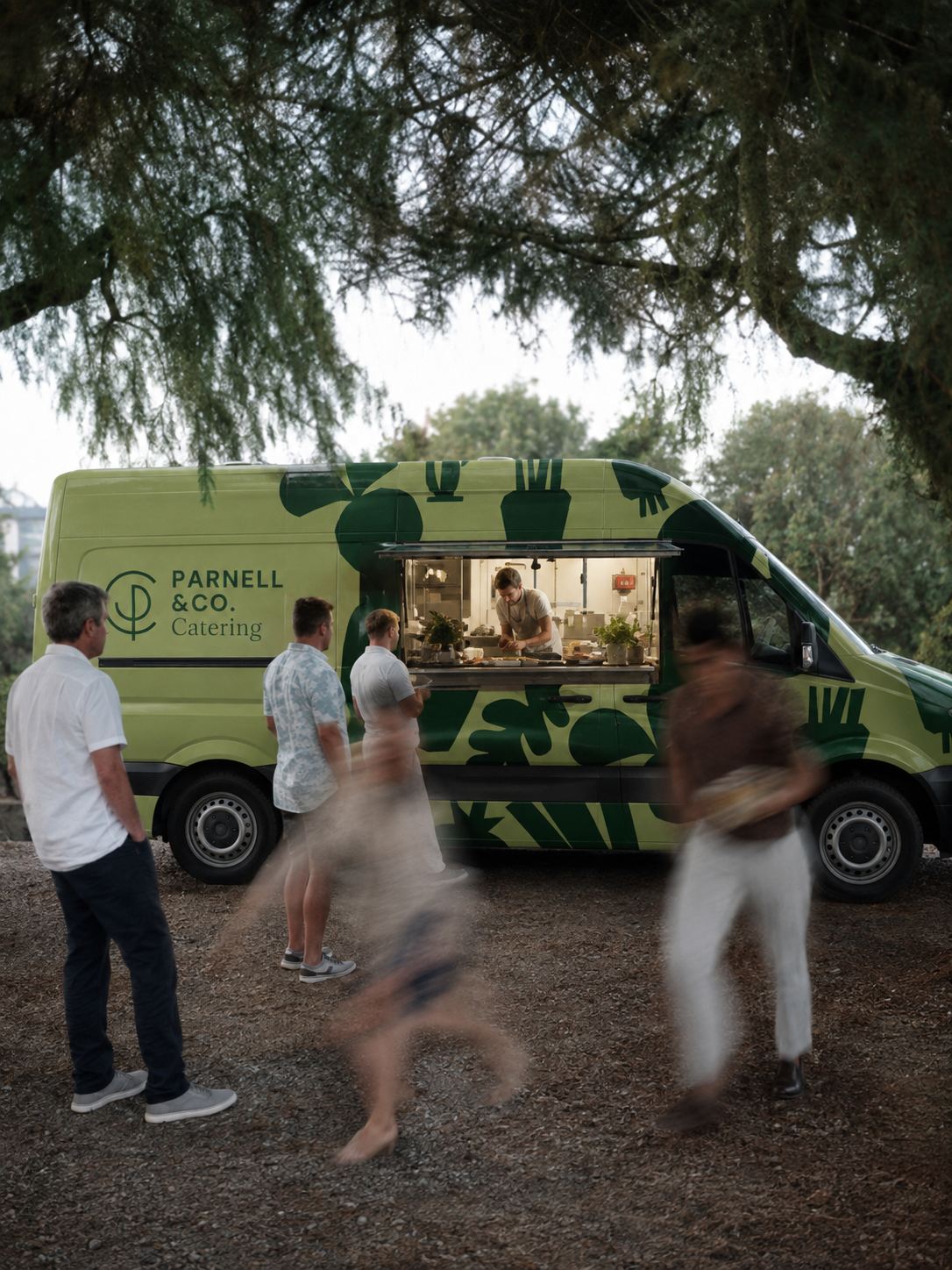
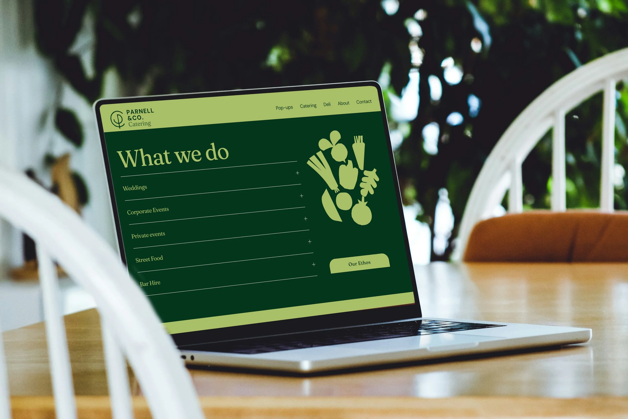
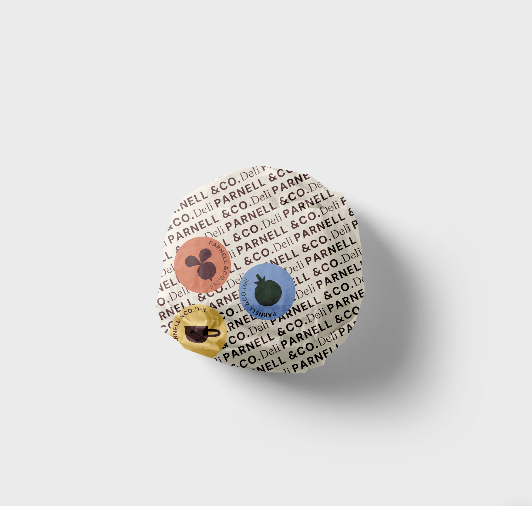
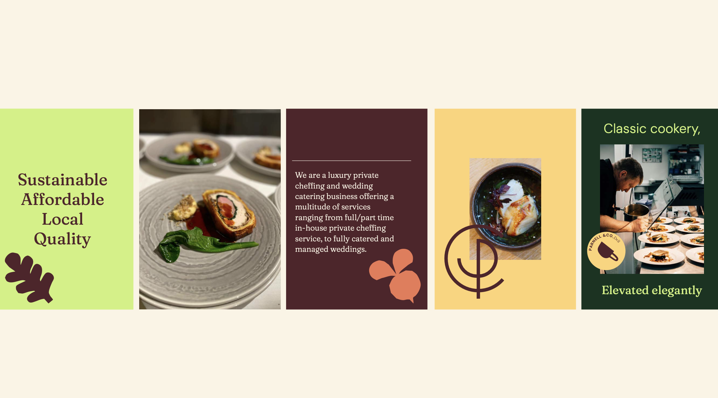
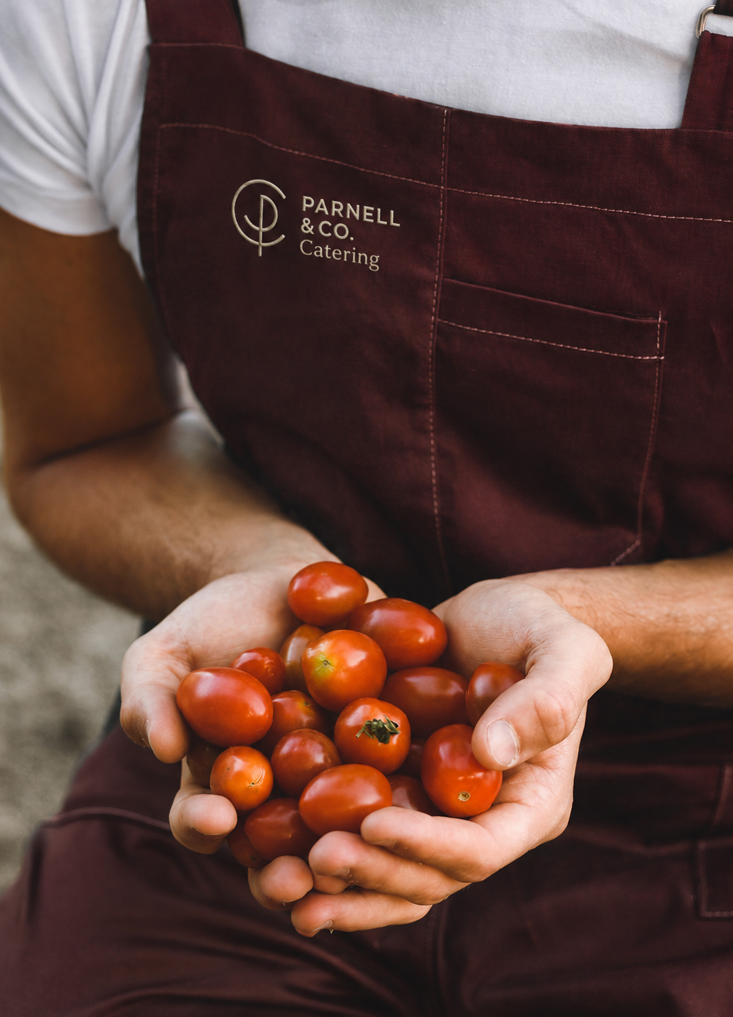
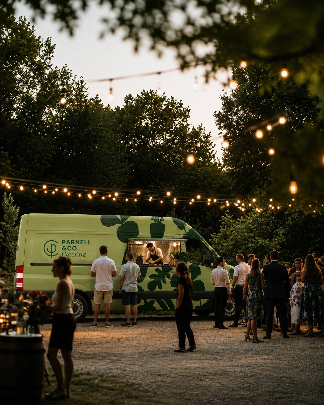
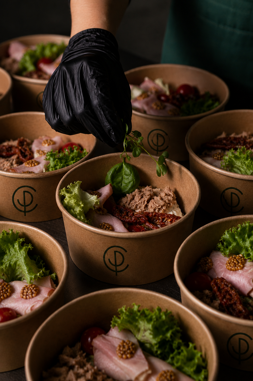
Parnell & Co’s food is focused on classic dishes and cooking you’ll know and love, elevated with carefully selected, fresh ingredients and the care and attention of a committed team. From bacon baps to bespoke banqueting, quality is at the forefront of everything they do.
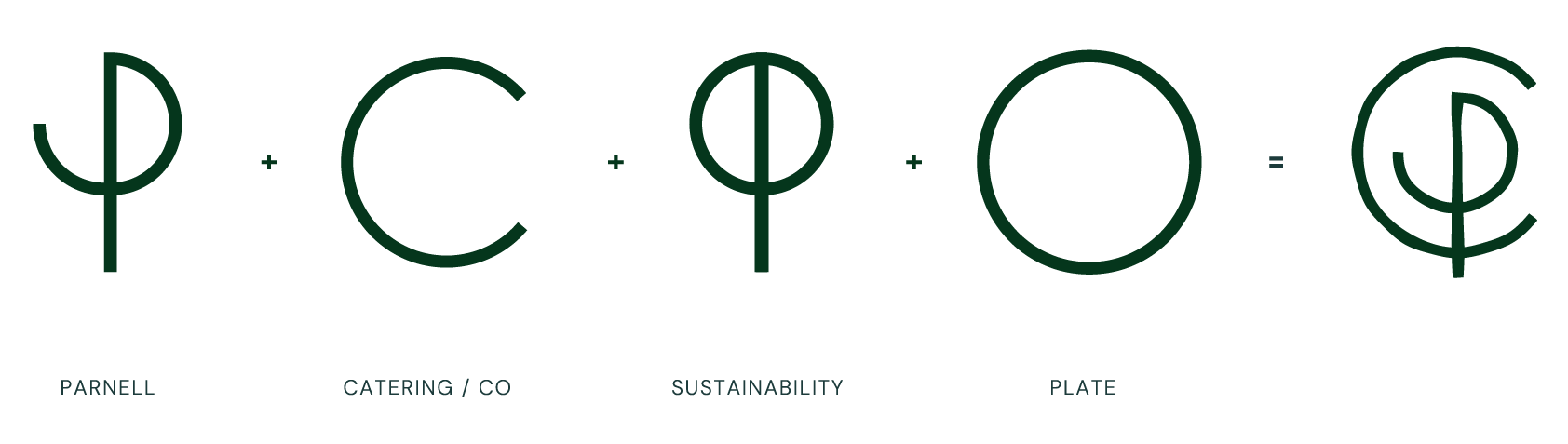
At the heart of the Parnell & Co identity is an emblem that combines elements from the brand name with a tree symbolic of the sustainable values of the brand, with a circular plate shape that nods to it being a food business to create a unique and ownable brand mark. It combines a serif and sans serif typeface to nod to the classical cooking but with a modern edge.
The colour palette combines warm, deep colours with brighter, fresh tones. They are inspired by key colours associated with food. Dark green is often associated with growth and new beginnings as well as sustainability. The wine and tomato shades have an earthiness and groundedness to them which feel stable and trustworthy. Yellow feels joyful and optimistic, and the lime feels vibrant, fresh and energising.

Oliver Parnell - Founder
“Thank you for the amazing work on the brand, I'm very happy with the end result.”