
Visual identity | Brand application | Art direction | Website design
Brighton Fibre: Building a local challenger brand offering fibre broadband to businesses and homes across Brighton & Hove


Brighton Fibre is a local, independent full fibre broadband provider that the people of Brighton and Hove want to share their homes and workspaces with. They tread lightly on the earth while providing infinitely scalable speeds, helping homes and businesses to keep pace with the digital world.
Rather than be recognised as just another broadband provider, they wanted to create a brand that represented their values and their love of the city. They wanted a brand that the community would be proud to support.
Founders Leo and Mark have strong beliefs around equality and sustainability. They believe that having a reliable internet connection is no longer a nice to have: it's essential to work and wellbeing, and is a key to a healthier local economy. They want to make fibre internet available to more people in the Brighton and Hove community, and find ways to provide it in a way that's kind to the earth.
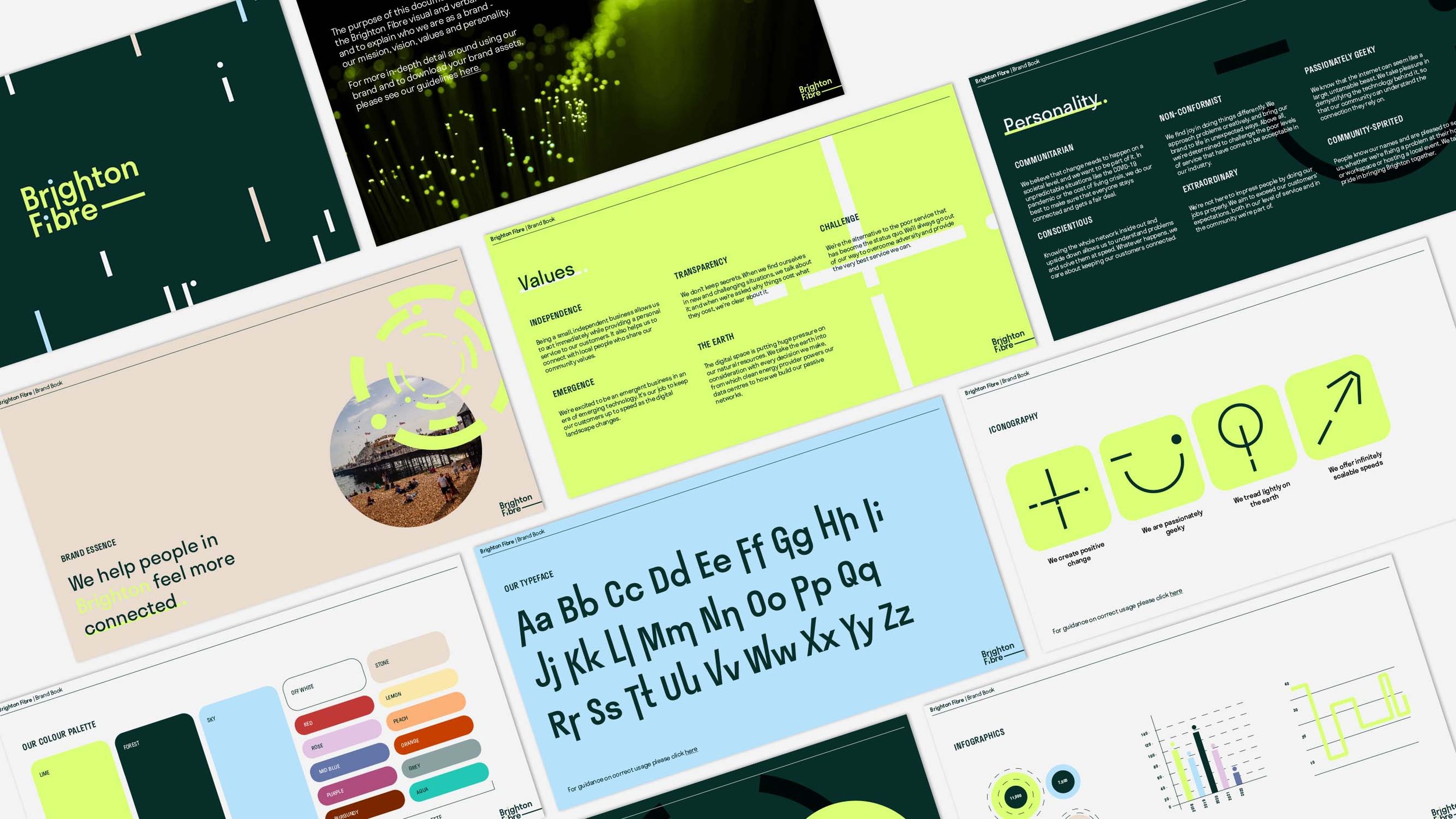
The concept for Brighton Fibre’s rebrand is around the idea of ‘where tech meets art’.
Brighton is a creative hub that is also making leaps in the tech world. The concept is inspired by the patterns created by data visualisation to create a unique and ownable brand language that showcases the beauty of Brighton Fibre’s technology.
One of the most important things to consider when designing the identity for Brighton Fibre was ensuring it was flexible enough to work across multiple areas and communities. Brighton is a diverse place that is split into different neighbourhoods, each with a different feel and different people. It was important we reflect this in the identity and ensure the core concept was transferable into different locations and “sub-brands” so we can specifically target each area with campaigns and content relevant to them.
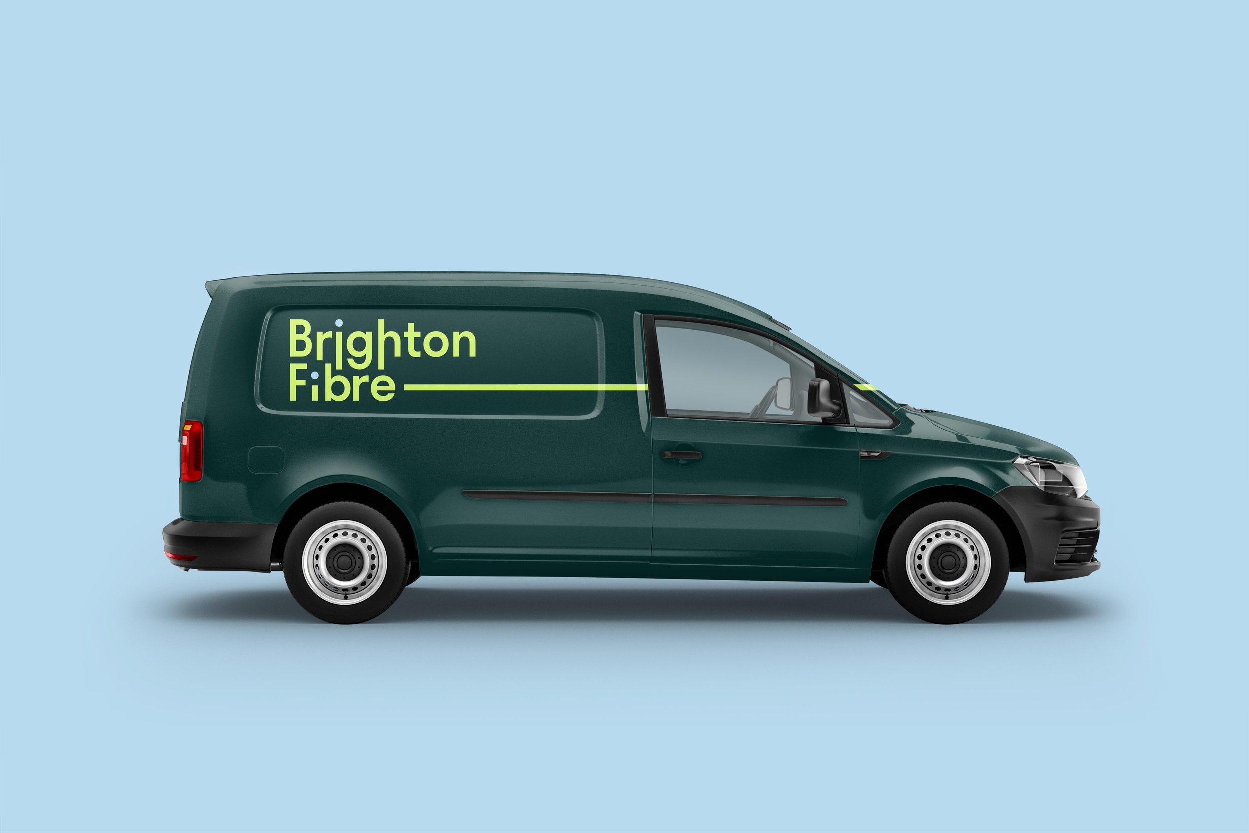
The colours are bright, vibrant and stand out to showcase the challenger nature of Brighton Fibre. The neon green feels techy but is paired with a dark green that has more of a ‘natural’ feel. It needed to feel fresh and accessible, yet bold and brave enough to step away from the visual cues of the rest of the internet-provider industry, which feels outdated and uninspiring. The Brighton Fibre brand instead meaningfully represents the community they serve.
Leo Brown, Co-Founder Brighton Fibre
“Working with Rose & Maddy was a breath of fresh air. Having a background in brand and marketing, I felt like I knew what to expect, but this was different. We were guided to really examine the soul of our business which has helped us converge all our ideas and inspiration around a central, defined purpose. Developing ideas and approaches with Rose & Maddy felt easy and fun - this wasn't just an amazing investment for the business, it felt like we were treating ourselves.”