

Visual identity | Naming
Ripple: Crafting an identity for a project with a mission to help end violence against women and girls


Ripple is a social enterprise tackling the problem of violence against women and girls globally. Ripple was born after the brutal and public murder of Sarah Everard which ignited a spark in the team to do something to directly address the wider issue of violence against women.
Ripple’s team are researching the root causes of violence against women and girls and are exploring ways in which they can help reduce the problem globally for both perpetrators (pre-crime) and survivors (post-crime). They approached me to help develop a visual identity that wp help to set the project apart and create a professional look and feel for the brand so that the team can approach possible stakeholders to support the project.
Ripple’s aim is to work towards eliminating violent interactions between men and women globally through understanding the root cause of this violence and developing an appropriate outcome that will address the systemic issue of violence against women and girls globally.
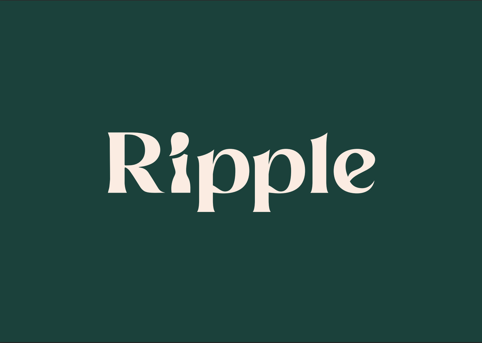
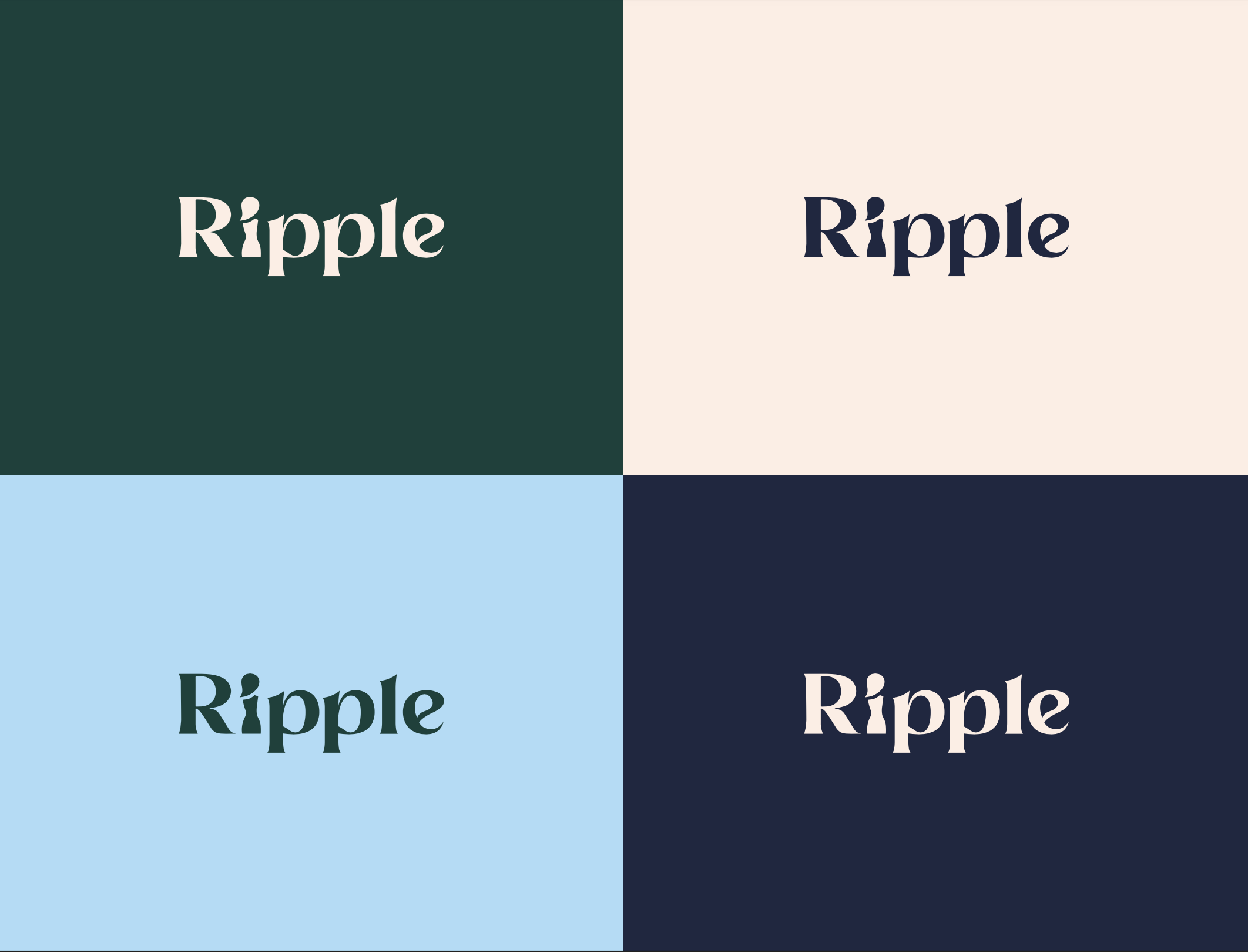
We began with developing a name for the project from which was inspired by the concept of a ‘butterfly effect’ created by the death of Sarah Everard - ‘when a butterfly wing beats somewhere in the world, its effects are felt far and wide.’ From this concept, Ripple was born. The identity for the project stems from the name. The typography was chosen to reflect the word itself. The ‘i” denotes a female figure and connects the brand to its mission in a powerful and symbolic way.
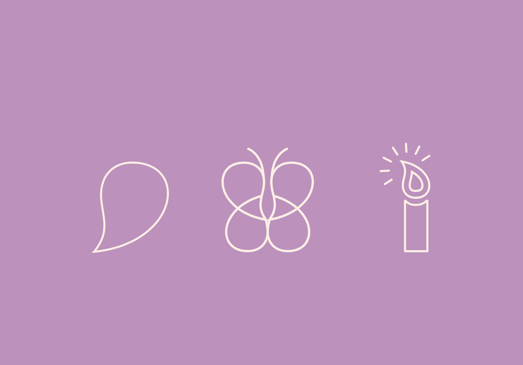
When designing the identity it was important to consider inclusivity through design that transcends linguistic or cultural barriers and to thinking about how the brand works universally so that everyone can be included. It was also key to ensure the design speaks to an audience that is larger than the individual through careful use of colour and photography and an accessible visual language like icons/shapes which are powerful language for connection, especially when spoken language is a barrier.

Imogen Aylwin - Founder, Ripple Global
“Maddy went above and beyond our expectations for delivery. We worked very closely as a team with her as she let us in on her creative process, sharing early allowed our team to input ideas and bounce off her creativity meaning we ended up with branding and guidelines that matched the brief and that we’re very proud to show off.”